Revenue
A complete guide to reading analytics about your revenue
This section of the documentation will help you understand how data about the revenue from your customers is displayed.
When you first login to the Tonos admin page, you will be redirected to the Dashboards page. From here you have to go the Revenue page, which is located in the Analytics section.
When you enter the Revenue page, the data is displayed like in the pictures below.
The percentage next to the metrics portrays the increase or decrease in values of the primary time period in correspondence to the comparison time period.
The lower bound time limit(starting date) is set at 00:00:00 CET(GMT+1) whereas the upper bound time limit(ending date) is set at 23:59:59 CET(GMT+1). e.g. If time period selection is set to a single day, analytics metrics are calculated for that single day from 00:00:00 to 23:59:59.
| Metrics | Description |
|---|---|
| It does not include deductions from refunds, however it does include deductions from discounts. Fixed and Recurring(Renewing) Subscriptions | |
| MRR | Sum of all MRR income* from Renewing Subscriptions as accounted for on the invoice statements, whose MRR period date falls within the selected time period. It does not include deductions from refunds, however it does include deductions from discounts. For longer term subscriptions, such as Subscription whose billing cycle lasts for 5 months, the amount they were charged for is divided by 5 and separated into five MRR periods with a cycle of one month, of which are then calculated in the MRR if they fall within the selected time period. |
| Revenue Per Subscriber | Calculated as follows: S = Active Subscriptions (attach reference to Subscriptions Dashboard Subscription Metric) R = Gross Revenue ARpU=S/R |
| Churned Revenue | Sum of revenue your application would have received if subscriptions hadn’t canceled within the selected time period. |
To get a better visual representation of the aforementioned metrics, view the Conversions Line Chart. The primary time period at the top left of the dashboard still applies to this graph. However, you have the option to view the data grouped by four different predefined intervals: Daily, Weekly, Monthly, Yearly. It’s worth noting that the week starts on Monday and ends on Sunday at midnight.
By default, all metrics are visible on the chart, if you wish to see only a specific metric you can just click/unclick on the legend metrics.
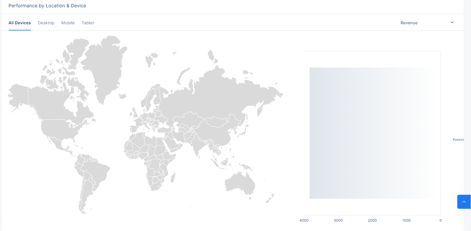
In addition to the line chart, we also provide geographical insights to your data. The same metrics are displayed, to which the same primary time period at the top left of the dashboard still applies, but this time around, the data is grouped by country. The geochart will display the TOP five(5) countries you are rendering clients from. As a treat, you can also filter the data by Device Type, be that Desktop, Mobile or Tablet.


