Conversions
A complete guide to reading analytics for your conversions
This section of the documentation will help you understand how data about the conversions of your customers is displayed.
When you first login to the Tonos admin page, you will be redirected to the Dashboards page. From here you have to go the Conversions page, which is located in the Analytics section.
When you enter the Conversions page, the data is displayed like in the pictures below.
The percentage next to the metrics portrays the increase or decrease in values of the primary time period in correspondence to the comparison time period.
The lower bound time limit(starting date) is set at 00:00:00 CET(GMT+1) whereas the upper bound time limit(ending date) is set at 23:59:59 CET(GMT+1). e.g. If time period selection is set to a single day, analytics metrics are calculated for that single day from 00:00:00 to 23:59:59.
An important factor to consider, is the fact that you cannot be provided with insights on this dashboard if you have not previously configured a DMP Provider under Integrations.
| Metrics | Description |
|---|---|
| Exposures | Defined as the total amount of times Campaigns have been displayed to end-users within the selected time period. |
| Unique Exposures | Out of the number of Exposures, how many times has a Campaign been displayed to unique users. |
| Conversions | Number of users who bought a subscription after it has been displayed to them. |
| Conversion Rate | U = Unique Exposures C = Conversions ConversionRate=C/U |
| Trials | Number of active trials during the selected time period. |
| New Trials | Number of new trials during the selected time period. |
To get a better visual representation of the aforementioned metrics, view the Revenues Line Chart. The primary time period at the top left of the dashboard still applies to this graph. However, you have the option to view the data grouped by four different predefined intervals: Daily, Weekly, Monthly, Yearly. It’s worth noting that the week starts on Monday and ends on Sunday at midnight.
By default, all metrics are visible on the chart, if you wish to refrain from seeing any of them, it suffices to click on the undesired metric on the legend to disable it in order for you to focus on some specific metrics at a time.
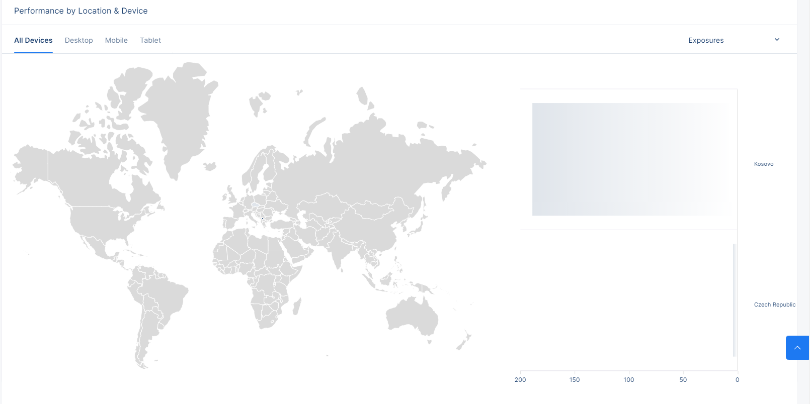
In addition to the line chart, we also provide geographical insights to your data. The same metrics are displayed, to which the same primary time period at the top left of the dashboard still applies, but this time around, the data is grouped by country. The geochart will display the TOP five(5) countries you are rendering clients from. As a treat, you can also filter the data by Device Type, be that Desktop, Mobile or Tablet.


